Now that we have a way to create categories, it’s time for handling bills.
We want to:
- have a way to enter a bill
- list all the bills
Let’s start with the first one. We’ll list bills in the next lesson.
Bills are stored in the App component, in its state bills property (an array). We already have the property in place.
Some design decisions I made:
- for each bill, we’ll store an object into this array, with a date, a category name, and the amount.
- the category is a string that represents the category name, not a reference to the category.
- for convenience, all bills are expressed in
$, but you can, of course, choose your own currency symbol.
Here’s an example bill object:
{
  date: '2018-01-30T15:08:26.118Z',
  amount: '220',
  category: 'Electricity'
}
I’m going to create an AddBill component, which will be very similar to the AddCategory component, except this time we have 2 more fields. One is a date picker, and another is a select that shows the categories list.
Let’s do it! First, let’s replicate the thing we have in the AddCategory component:
import React, { useState } from 'react'
export default props => {
const [amount, setAmount] = useState(0)
const handleChangeAmount = e => {
setAmount(parseInt(e.target.value), 10)
}
const handleSubmit = e => {
e.preventDefault()
if (!amount) {
alert('Please enter an amount')
return
}
props.onSubmit(amount)
}
return (
<form className="h-100 w-full flex items-center justify-center font-sans">
<div className="bg-white rounded shadow p-6 m-4 w-full lg:w-3/4 lg:max-w-lg">
<div className="mb-4">
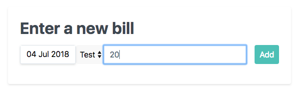
<h1 className="text-grey-darkest">Enter a new bill</h1>
<p>E.g. 'Electricity' or 'Gas' or 'Internet'</p>
<div className="flex mt-4">
<input
className="shadow appearance-none border rounded w-full py-2 px-3 mr-4 text-grey-darker"
placeholder="Add category"
value={amount}
onChange={handleChangeAmount}
/>
<button
className="flex-no-shrink p-2 border-2 rounded bg-teal text-white border-teal hover:text-white hover:bg-teal"
onClick={handleSubmit}
>
Add
</button>
</div>
</div>
</div>
</form>
)
}
Now, as mentioned we need a select that shows the categories. Those categories must be passed by the parent component App since AddBill does not have any notion of what categories are and what they are used for.
We pass the categories array as a prop:
<select>
  {props.categories
    ? props.categories.map((value, index) => {
        return (
          <option key={index} value={value}>
            {value}
          </option>
        )
      })
    : ''}
</select>
When the select changes we need to update the selected category. By default, it’s the first category passed in the categories prop:
//...
const [category, setCategory] = useState(props.categories[0])

//...
const handleChangeCategory = e => {
  setCategory(e.target.value)
}
Now it’s the turn of the last form element: the date picker.
Datepickers are hard to write, and so as a good lazy developer I searched “react datepicker” on Google, and I found this.
All we need to do is to add react-datepicker to the CodeSandbox dependencies, or if you are doing this project locally, run
npm install react-datepicker --save
or
yarn add react-datepicker
in the command line, from the root of your project.
Now we can import the react-datepicker component, and its CSS:
import DatePicker from 'react-datepicker'
import 'react-datepicker/dist/react-datepicker.css'
Then we add the state and change event handler:
const [date, setDate] = useState(new Date())
//...
const handleChangeDate = e => {
  setDate(e.target.value)
}
here’s the JSX:
<DatePicker selected={date} onChange={handleChangeDate} />
We’re almost done! Now we just need to implement the handleSubmit method, which is triggered when we press the Add button:
const handleSubmit = e => {
  e.preventDefault()
  if (!amount) {
    alert('Please enter an amount')
    return
  }

  props.onSubmit(amount, category || props.categories[0], date)
}
we check if the amount value is filled (date and category are always initialized to a first state, so there’s no need to check for their value), and we emit the onSubmit event to the parent, with as parameter the date, the category and the amount.
Using the or operator || we default to the first category if not set.
In the App component, we map onSubmit to the addBill function:
<AddBill onSubmit={addBill} categories={categories} />
Let’s implement this method:
const addBill = (amount, category, date) => {
  const bill = {amount, category, date}
  const updatedBills = [...(bills || []), bill]
  setBills(updatedBills)
  setShouldShowAddBill(false)
  localStorage.setItem('bills', JSON.stringify(updatedBills))
}
bills and setBills come from a new hook, which is same as we did for categories:
const [bills, setBills] = useState([])
setShouldShowAddBill is the same as setShouldShowAddCategory:
const [shouldShowAddBill, setShouldShowAddBill] = useState(true)
We repeat what we did for the categories to retrieve the bills from local storage in the useEffect() callback:
useEffect(() => {
  const categoriesInLocalStorage = JSON.parse(
    localStorage.getItem('categories')
  )
  const billsInLocalStorage = JSON.parse(localStorage.getItem('bills'))

  setCategories(categoriesInLocalStorage)
  setBills(billsInLocalStorage)

  if (!categoriesInLocalStorage) {
    setShouldShowAddCategory(true)
  }
}, [])
We only show this AddBill component if the shouldShowAddBill state property is true. And this will be handled later, but let’s add the logic to show it now, so we can test it.
We need to reorganize a bit the layout of the components in the App component. We only want to show this when shouldShowAddCategory is false, and we need to add another check for shouldShowAddBill:
function App() {
  //...
  return (
    <div className="App">
      {shouldShowAddCategory ? (
        <AddCategory onSubmit={addCategory} />
      ) : shouldShowAddBill ? (
        <AddBill onSubmit={addBill} categories={categories} />
      ) : (
        <div>
          <NavBar categories={categories} showAddCategory={showAddCategory} />
          <div className="container flex">
            <div className="w-1/2">
              <BillsTable />
            </div>
            <div className="w-1/2">
              <Chart />
            </div>
          </div>
        </div>
      )}
    </div>
  )
}
You should see it working now:
and if you try adding something and pressing “Add”, the view should show this:
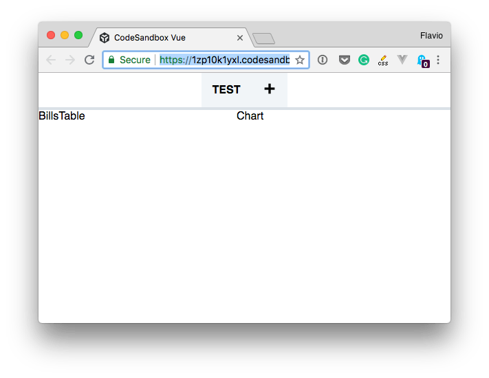
See the app in the current state on CodeSandbox.